{{item.name}}
Price: {{currency}}{{item.price| numberThousandsCommas | numberDecimalPoint}}
Qty: {{item.amount}}
Remote Work & Learning
Projector
Monitor
Lighting
Interactive Display | Signage
Remote Work & Learning
Store

Fine Art and Commercial Photographer / UK
Photographer Mark Wood splits his time between commercial work and teaching, whilst ensuring he makes time for his personal projects. Mark trained as a printmaker, utilizing the traditional techniques of etching and lithography to create fine art print, before moving to digital print in the mid 90’s.
I’ve been teaching colour management in a variety of guises for decades. I walk a fine line through a complicated landscape, trying to balance the needs of plain language with the esoteric terms and acronyms used in technical writing. The extended title for this post could be, ‘Working In The Light, or Should I Close My Curtains When Using Photoshop?’
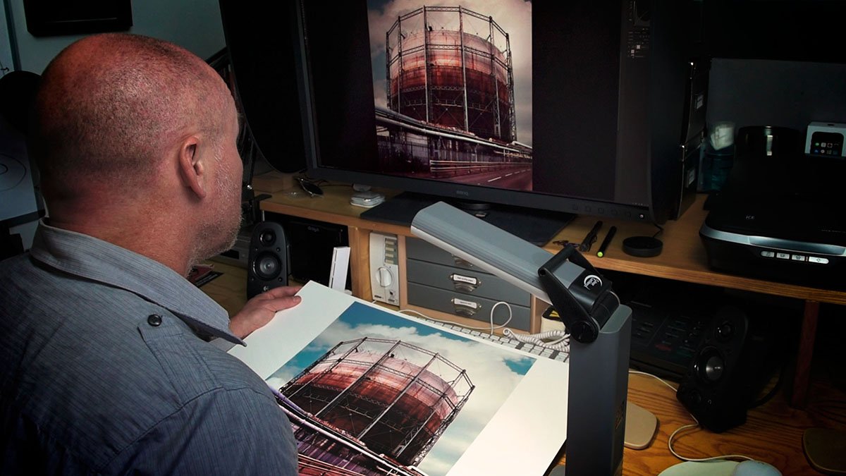
Figure 01: Working in digital darkroom conditions does not mean being in total darkness.
When it comes to post-processing most advice, including my own, suggests that photographic editing should be done in low light; it’s a topic I have covered before.
In order to make to most of the dynamic range of your monitor you should set up a digital darkroom that meets the following specifications:
i) Set the ambient light levels in a range from 4 to 16 lux. There is no need to be in total darkness, but the darker the room the better. Above 16 lux and the room would be so bright as to adversely affect the dynamic range of the monitor.
1 lux can be described as equivalent to moonlight, let’s assume that is a full-moon in the middle of the night. Note the perceived brightness of moonlight increases as your eyes adjust to night-vision. Another way to assess ambient light is to see if you can read printed text in the darkened room when away from the light of your monitor. If the text is only just readable, then that is a good ambient light level.
ii) Make sure that any doors or window-blackouts do not let sunlight light seep in. Bright light including a monitor set above 120cd/m2 will spoil your low-light vision.
iii) The room should be artificially lit, with a diffuse, indirect light source that is not in the same field of view as the monitor. In Figure 01 the light should really be further away from the monitor. The monitor needs to be shielded so that reflections do not occur, the BenQ SW series monitors ship with shading hoods, and should be used. Artificial light should have a colour temperature of 5000 K (Kelvin)
iv) The room should be painted in a neutral colour, such as Munsell 8 Grey. The ceiling can be used as a light diffuser so should be a neutral white (titanium based pigment).
v) Do not place colourful objects near to the monitor, or wear brightly coloured clothes whilst editing. Such colours can affect the perception of other local colours.
vi) Set the desktop background of your display to a neutral grey. In Photoshop pressing F on your keyboard will do this. When assessing an image, pressing the TAB key will remove all other distracting elements from the Photoshop interface. In Lightroom using Lights Out will do a similar thing, Choose Window > Lights Out > Lights Off will do this, or press L on your keyboard to cycle the Lights Out mode.
The perceived colours of a print are dependent on the lighting used. Lighting booths provide a colour corrected light source of appropriate luminosity, so that correct colour hues can be observed. A booth also allows all the steps of tonal change to be seen; this is especially important in the shadow areas of a print. Commercial booth are expensive but self-build instructions can be found on a variety of internet sites.
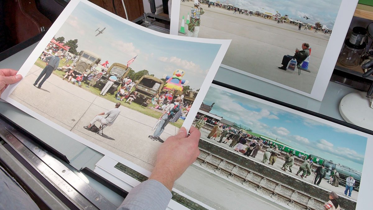
Figure 02: Using natural light to evaluate prints is ideal, but if using artificial illumination the lights have to be balanced for daylight.
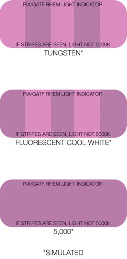
RHEM® Lighting Indicator Strips indicate correct D50 (daylight) proof viewing conditions and can be purchased to help assess that correct lighting conditions are being met.
An illustration of PIA/GATF RHEM® Light Indicators have been included (Figure 03) to demonstrate how a RHEM strip works. If stripes are seen the ambient light is not 5000K.
Figure 03: PIA/GATF RHEM® Light Indicators: If stripes are seen the ambient light is not daylight balanced.
The key ingredient is a calibrated and profiled colour critical display such as one of the excellent the BenQ SW series, but we are all human, we tire, we may even perceive colour differently. Working in darkroom conditions should be reserved for the most colour critical aspects of photography’s workflow. However, ingesting files, key-wording and captioning, backing-up, and simple exposure adjustments can be made, with reference to histograms and curves, in daylight.
As a UK based photographer I am only too aware that changes in weather effect when I can shoot outdoors. In addition when post-processing the fall and rise of ambient light as clouds obscure the sun subtly change my perception of the tones and colour of a photograph onscreen.
I find it best to do as much post-processing work in daylight conditions, then move to digital darkroom conditions for short periods. The joy of colour management using balanced artificial light and a great monitor is that when my prints are made I can walk into the daylight and assess the quality of my colour management in real-world conditions with few, if any, surprises.
{{productsCount}}Result
{{item}}
{{item.productWordingTag}}
{{currency}}{{item.finalPrice| numberThousandsCommas | numberDecimalPoint}} Save {{currency}}{{item.saveAmount | numberThousandsCommas | numberDecimalPoint}} Save {{item.savePercent | numberThousandsCommas | numberDecimalPoint}}%
new device price {{currency}}{{item.regularPrice| numberThousandsCommas | numberDecimalPoint}}
{{item}}
{{itemTag.title}}
Max 4 products to compare reached.