{{item.name}}
Price: {{currency}}{{item.price| numberThousandsCommas | numberDecimalPoint}}
Qty: {{item.amount}}
Remote Work & Learning
Projectors
Monitors
Lighting
Interactive Displays & Signage
Remote Work & Learning
Shop
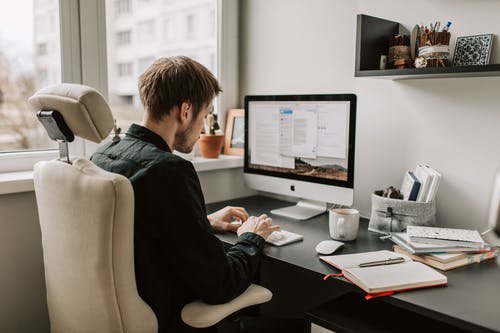
Are you snowed under with remote working? As COVID-19 influences our ability to work from the office, workers will experience more at-home screen time. Extensive hours of remote working will therefore lead to a type of eye discomfort, called digital eye strain.
Yes, you may already know this word but might be wondering what digital eye strain is, what treatment is available, the causes, and what the symptoms are. Don’t worry, this article will walk you through these questions and give you some tips to fix and avoid digital eye strain.
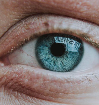
Digital eye strain, also called computer vision syndrome, is; by definition, a vision-related problem that is primarily based on the prolonged exposure to digital devices, such as smartphones, laptops, and tablets.
Digital eye strain statistics say that 59 percent of American adults experienced digital eye strain symptoms in 2018. And in the 2020 research into digital eye strain, this number has a significant increase due to increasing social media actions, such as changed habits as there is less time commuting.
Q: How is ‘prolonged’ defined when talking about screen time?
A: 2 hours at a time is usually considered as ‘prolonged’
Digital eye strain results from closer working distance between the worker and the monitor. People used to read books at less than 20 inches, but with the release of digital devices, now reading distances have dropped to 10 inches. The closer we are, the more eye movement there is, which can put strain on our focusing muscles.
Patients who have digital eye strain, might be experiencing:
• Red eyes & dry eyes
• Blurred vision
• Headaches & fatigue
• Trouble concentrating
• Sensitivity to light
• Interruption to a normal sleep pattern
Potential causes of these symptoms include:
• Glare from a digital screen
• Poor lighting in the room
• Blinking less than normal
• Improper viewing distance
• Blue light exposure
Although extended computer use or inadequate/excessive lighting may cause eye strain, no evidence shows that there are permanent effects of computer vision symptoms.
You don’t need to cut out all screen time to protect your eyes, here are some tips that help you get relief from eye strains while using your digital devices:
There is an old 20-20 rule that people are supposed to take a 20 second break every 20 mins within 20 feet away. While people are staring at a screen at a closer distance the whole time, blinking could turn into a conscious effort.
Tips: concentrate on something far away, which helps you reset messages between your eyes and brain, if you feel difficulty following 20-20 the rule, at least take a rest for 15 mins every 2 hours.
Go to the doctor and tell them how much you are doing whilst working from home, to set up a medical plan. Your doctor will test your vision and ask some questions to see what may cause the symptoms of your digital eye strain.
Here are the questions you can expect from the doctor:
• How much time do you spend on digital devices per day?
• When was your last vision exam?
• Does anything help reduce your symptoms?
• When did you first notice these symptoms?
• Does a fan blow air around your face at work? Or do you work in an air-conditioned environment?
Over-the-counter eye drops can keep your eyes clean and healthy. In addition, placing a warm towel for about 10 mins at 45 to 50 Degrees Celsius can boost oil production on your eyelids, and generate blood flow to the fatigued eye muscles.
Friendly notice: Artificial tears with vitamin B12 & B6 are the best eye drops for eye strain.
Maybe you don’t wear glasses at all, but you could consider a specific digital eyewear that helps protect you from blue light harm caused by increased screen time, especially under the remote-working pattern.
How to select good glasses for eye strain: Everything You Need To Know About Computer Glasses
According to the experts, most people feel most comfortable when looking at the computer screen at about 15-20 degrees below their eyes. To further avoid digital eye strain, you can make the text size larger and change the brightness of your screen.
Which font size can relieve eye strain?
Bigger fonts, to some extent, are always better for your eyes. Normally speaking, text should be three times the smallest size you can read from a current viewing position.
Friendly notice: when it comes to a mobile website, 16px is the best font size for your eye care.
Which screen colour is best for your eye?
Speaking of color combinations, our eyes prefer black text on a white or
slightly yellow background. Other dark-on-light combinations work fine for most people.
You might be asking: “why should I care about lighting?” Sometimes, your monitor is inadequate to match your surrounding work place brightness; and the dim interior lighting in your workplace may make your digital eye strain even worse. At this moment, picking up a right desk lamp will help reduce eye pressure.
Extensive reading: What Light Is Dangerous To The Eyes?
Natural daylight can activate your brain cells and help reduce digital eye
strain. So, it is suggested to purchase such a desk lamp which can mimic such lighting conditions. To make it clear and save your time, here are some factors to consider:
• Glare free
• Auto dimming
• Space saving
• Adjustable colour temperature
• Low blue light exposure
• Recommended light level (500 Lux)
Extensive Reading: Relieve eye strain with the best Monitor Lamp
We think you are fully up to speed with the causes and symptoms of digital eye strain, and how you can improve your working environment to prevent or relieve it. If you want to find out more about lighting or ways to protect from digital eye strain, join BenQ Knowledge Center
{{productsCount}}Result
{{item}}
{{item.productWordingTag}}
{{currency}}{{item.finalPrice| numberThousandsCommas | numberDecimalPoint}} Save {{currency}}{{item.saveAmount | numberThousandsCommas | numberDecimalPoint}} Save {{item.savePercent | numberThousandsCommas | numberDecimalPoint}}%
new device price {{currency}}{{item.regularPrice| numberThousandsCommas | numberDecimalPoint}}
{{item}}
{{itemTag.title}}
Max 4 products to compare reached.