{{item.name}}
Price: {{currency}}{{item.price| numberThousandsCommas | numberDecimalPoint}}
Qty: {{item.amount}}
Accessories

This is my second post in a series of tutorials, essays, and videos that aim to mystify Colour Management. Here I cover a very mundane subject. Without any fuss or fanfare Adobe Photoshop will colour manage your photographs, but the default preferences may not yield the best results. Understanding how to tweak the Color Settings in Photoshop is an important part of a reliable colour management workflow. Some parts of Colour Management are exciting, as they reveal possibilities for new creative processes. This topic is not one of them, but it is an important one. I’m using Photoshop because it is used extensively in Photography.
My use of the letter ‘u’ in colour is revealing; I’m British. Your geographical location is important too. Ideally Photoshop’s Color Settings should be based on your country. The reason for this will become clear later.
In 1996 I touched all four corners of the Photoshop universe, since then the application has grown exponentially. Many of Photoshop’s darkest places are rarely visited, here we will shine a light on Color Settings In Adobe Photoshop. The tutorial will require patience and careful reading. I repeat, this stuff is rather mundane as such it is rarely covered in magazines who prefer sassier subjects. If you feel unsure about doing the practical element of this tutorial please just read through it, and perhaps take a few Photoshop classes.
Steps One & Two explain how to reset Photoshop’s Color Settings should you feel lost. Fiddling about in Photoshop can be stress inducing, but I want to keep things as clear as possible. Your reward for taking this journey should be greater accuracy in print and on-screen output.
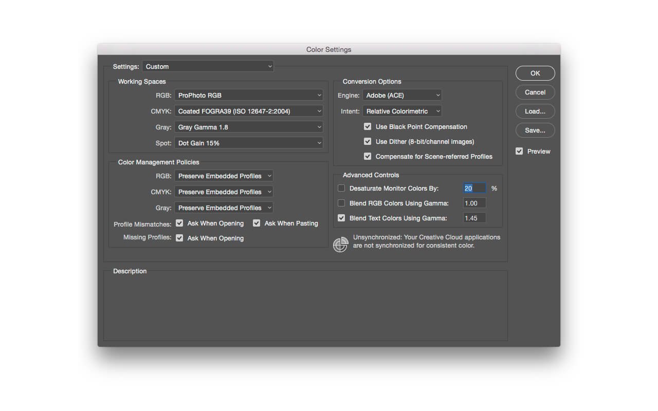
A First Look At Color Settings…
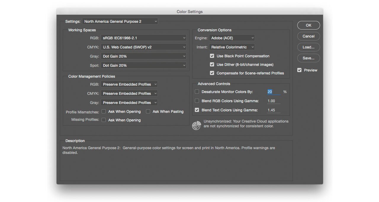
1. Choose Edit > Color Settings…
2. The Default setting is North America General Purpose 2. Older versions of Photoshop may list this as North American General Purpose. Take note of the selected option in the Settings drop-down menu on your system, which may not be North American General Purpose, and write it down. This is your failsafe, should your experiments not work out, select the default you find here, for example North America General Purpose 2, and your Color Settings will be restored.
However, should the menu list Settings as Custom you have already made changes to your Color Settings. I suggest you read through this tutorial. In Step 10 you will learn how to save your Custom settings. Once you know how to save your Custom settings you can return to following this tutorial from Step 3 onwards.
Please Note: No changes will be made to your Color Settings until you click OK in the window. Remember you can click Cancel to exit Color Settings without making changes.
3. Click away from the Settings menu to close it.
4. Move your Cursor over the elements of the Color Settings window, as you hover over headings, menus, and checkboxes the Description field at the bottom the of window provides a definition for each element. The terminology maybe a little opaque, so let us review the essentials.
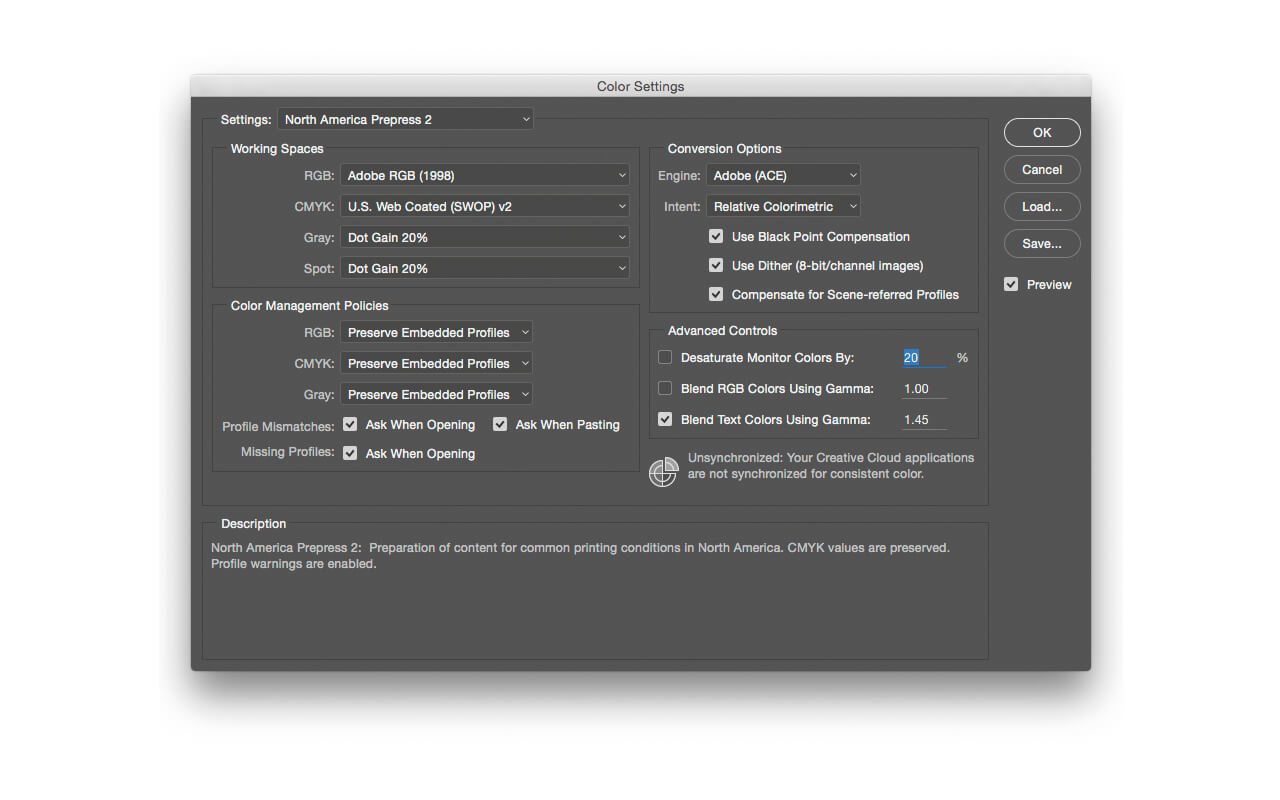
5.Look at the Color Management Policies section of the window. The boxes for Profile Mismatches, and Missing Profiles are not checked.
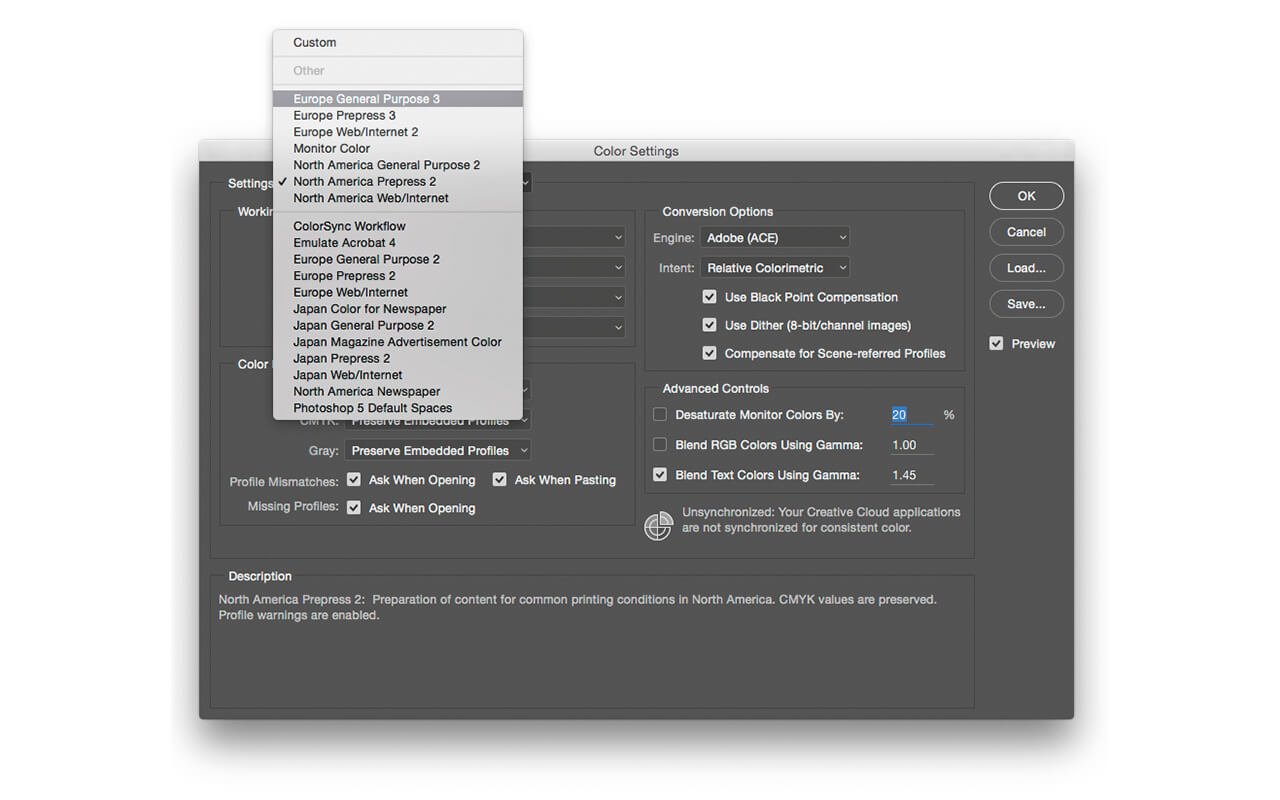
6.Use the Settings menu to select North America Prepress (2). Now all three boxes are checked. This can be seen as the professional option. With these boxes checked Photoshop will warn you every time it makes a colour management decision.
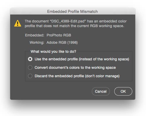
In Figure 04, the screen grab warning cautions that photograph being opened has a ProPhoto RGB profile, but Photoshop is currently set to work in Adobe RGB (1998). The default action is, Use the embedded profile (instead of the working space). Which is exactly what Photoshop would have done if the Profile Mismatches box was not checked; it would open the photograph with making changes.
The warning may seem irrelevant, and for many photographers having two out of the three Profile warnings selected is not strictly necessary.
Think of the warnings as being empowered by the knowledge that Photoshop is handling colour for you, but they can be overwhelming. However I do recommended that you have the Missing Profiles box selected. If a photograph is ‘untagged’, meaning no colour profile has been applied, Photoshop will guess at the colours for you. It will assume that an ‘untagged’ image is sRGB. Photographs tend to be either sRGB, Adobe RGB (1998), or ProPhoto RGB. If ProPhoto RGB photograph is untagged and opened under the assumption that it is an sRGB image the colour will be dreadful.
I like to see warnings for ‘untagged’ photographs, so that should such a photograph open in Photoshop and the colours look horrible, I can guess why.
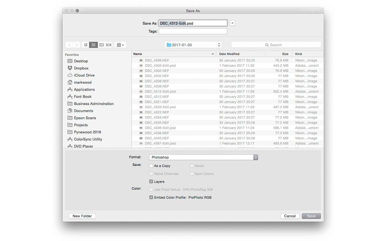
It is important for all digital images to have a colour profile assigned. Cameras, scanners, and other input devices will apply profiles by default, but it is very easy to save a file in Photoshop and not include the all important profile.
Here is Photoshop’s Save As window, the box for Embed Color Profile is checked. In this instance a ProPhoto RGB profile will be tagged to the photograph. So long as Color Profiles are used properly many Colour Management issues will be resolved.
Let us return to the Color Settings window. Having written so much, only to have covered one aspect of one window in Photoshop, you may feel perplexed, and concern that this tutorial will become an epic. However, there is no need to explain every aspect of the Color Settings window. To summarise, Photoshop handles colour behind the scenes, and you can switch on warnings that caution you about Photoshop’s inner workings. Most importantly all photographs should be tagged with a Colour Profile.
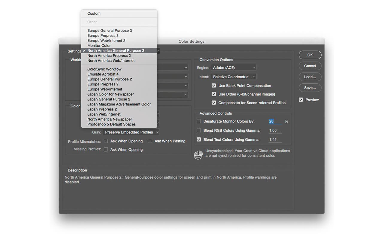
For many choosing a setting is the first step. As someone working in Britain choosing one of Europe settings would be appropriate. There are settings for Japan and North America too, each region has three subcategories; General Purpose, Prepress, Web/Internet.
Regardless of your region, the General Purpose is the best option for newbies to Colour Management. The Web/ Internet setting will cause colour conversations to happen automatically, so along with Prepress is best left alone, for now.
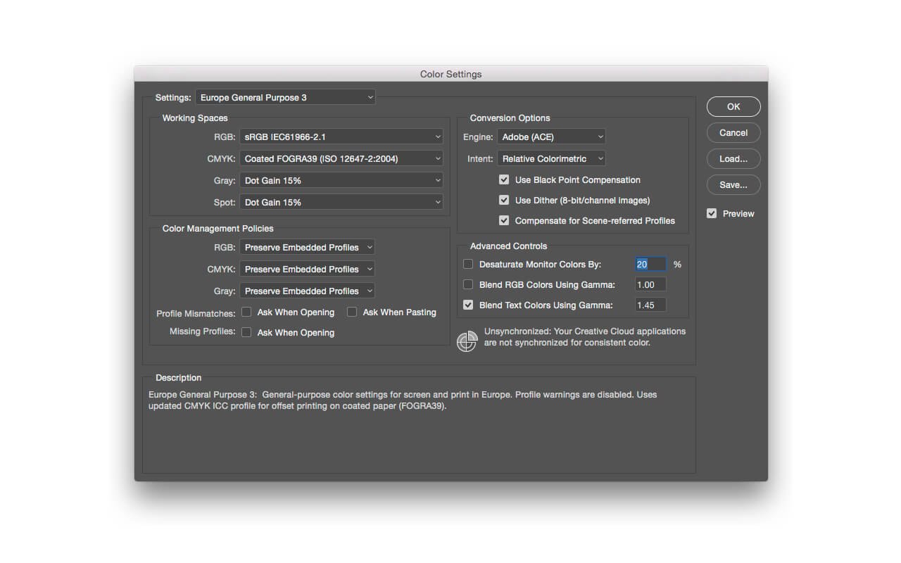
7. Choose the General Purpose setting for you geographic region. In Figure 07 I have selected Europe General Purpose (3), because I am based in England.
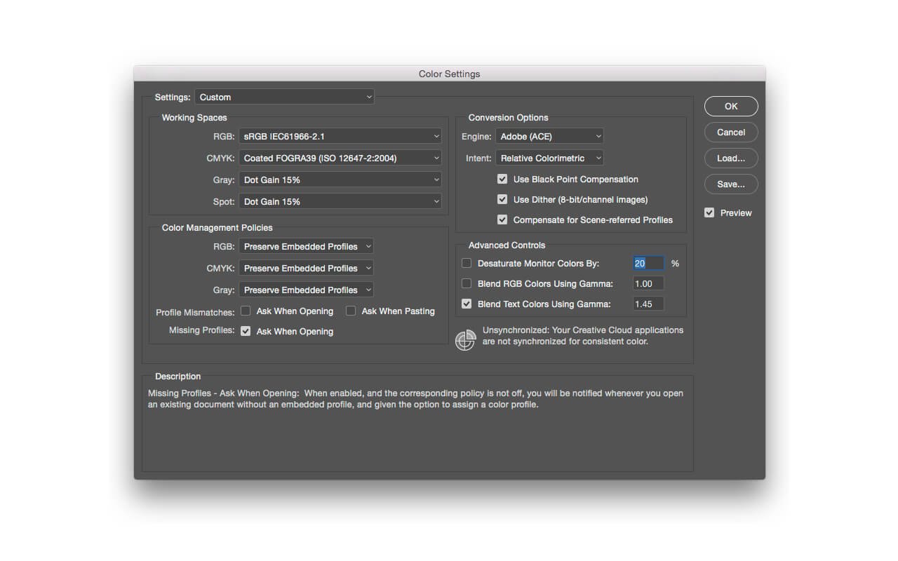
8. As suggested early, it is a good idea to have a warning appear if a file has no profile. Figure 08 shows Missing Profiles has been selected. Once this box is checked, the Settings name changes to Custom. Now is a good time to save your custom settings, though you may wish to set one addition option.
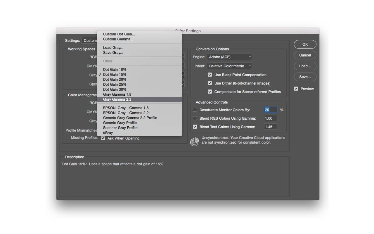
9. Some people argue that it is a good idea to have the Gamma of your greys to match that of your RGB colour. As all my black and white photographs are kept in RGB mode I rarely use greyscale, but should I want to match my gammas, I would click on the Gray menu in Working Spaces and select Gray Gamma 2.2, when my RGB working space is sRGB.
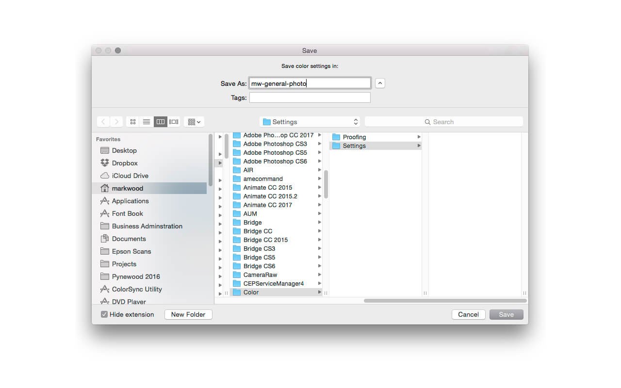
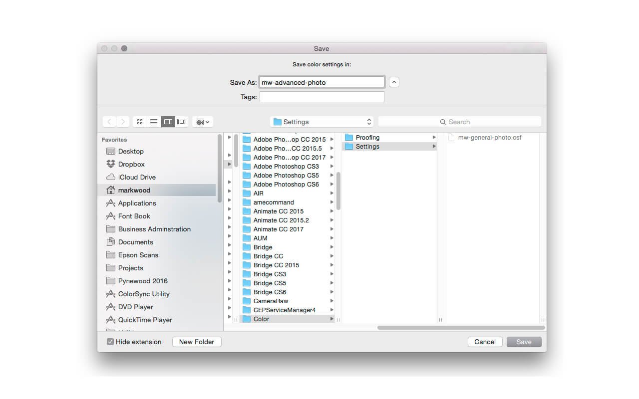
10. Because I do not want to spend time reconfiguring my Color Settings I save mine as a preset. In the Color Settings window click Save… A Save window opens, MS Windows users will see a different window, though the principle remains the same, give your preset a name, for example (yourinitials)-general-photo. Do not change the default location for saving the preset.
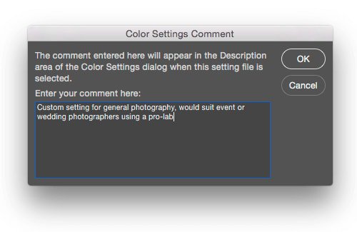
11. Clicking Save opens an additional window where you can add a comment to your Color Settings. In Figure 11, I have written, ‘Custom setting for general photography, would suit event or wedding photographers using a pro-lab’. I like to write something here as sometimes I need clues to my past reasoning.
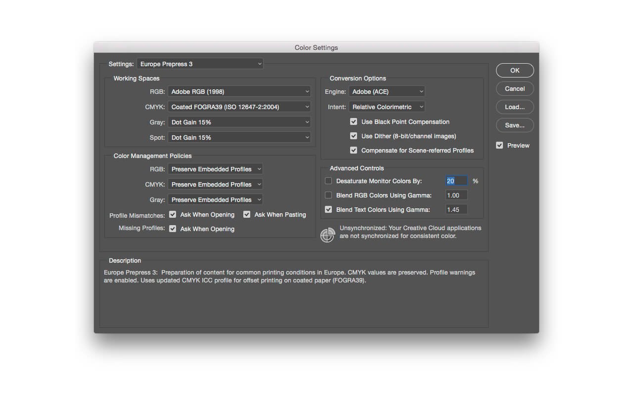
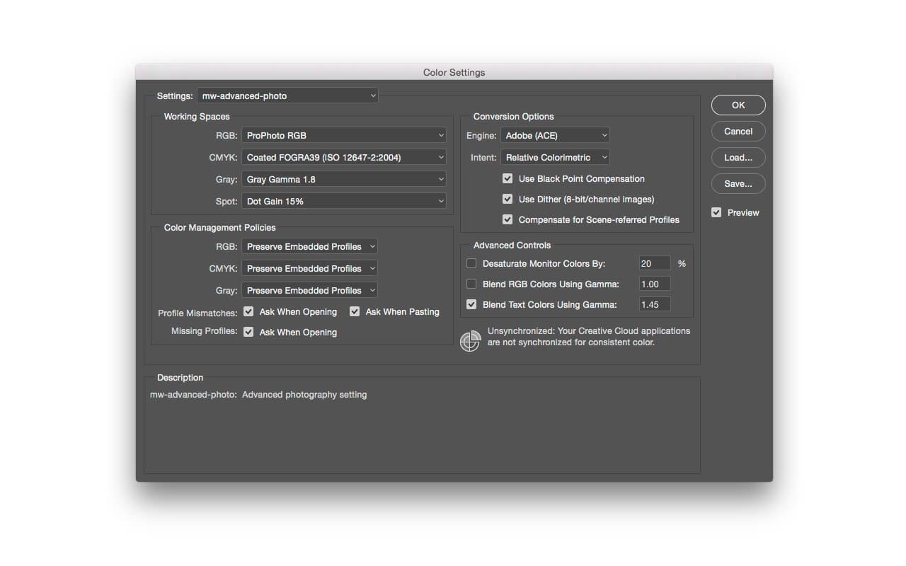
Steps 12 to15 illustrate my default colour settings, which require more consideration than the basic settings outlined in Steps 7 to 11. As my workflow uses Lightroom and Photoshop I set ProPhoto RGB as my RGB working space. This is the immoveable Lightroom default, so I want Photoshop to be the same.
12. For advanced user settings, that may cause lots of warnings to appear, and requires sRGB conversions to be made for photo-lab printing, I set Prepress as my starting point. In Figure 12 Europe Prepress 3 has been selected.
13. Change the RGB working space to ProPhoto. Now Photoshop will have the same synthetic RGB colour space as Lightroom. As with Step 9, if I want my greyscale gamma to match ProPhoto RGB I would need to set Gray to Gray Gamma 1.8. The arguments for gamma settings of 1.8, 2.2, or higher could be made here, but to repeat, most photographers keep their black and white photographs in RGB mode, and therefore in monochrome
14. Click Save… in the Color Settings window. Give your custom setting an appropriate name. The eagle-eyed will have noticed a Load… button. You can use this when sharing settings amongst several users. In graphic design production, a print company may send their preferred colour settings for designers to load. In photography the option is less relevant.
15. If you have followed all fifteen steps you will have two custom Color Settings to choose from. However mundane this may seem, unnecessary colour conversions need to be avoided, and once you have the settings saved you can get back to more creative tasks.
To conclude, I have found these settings matter. As I work with a range to disciplines including video, print, and photography I feel reassured knowing how Photoshop is handling my tone and colour. In my next post in this series I will show you how to calibrate a colour critical display.
{{productsCount}}Result
{{item}}
{{item.productWordingTag}}
{{currency}}{{item.finalPrice| numberThousandsCommas | numberDecimalPoint}} Save {{currency}}{{item.saveAmount | numberThousandsCommas | numberDecimalPoint}} Save {{item.savePercent | numberThousandsCommas | numberDecimalPoint}}%
new device price {{currency}}{{item.regularPrice| numberThousandsCommas | numberDecimalPoint}}
{{item}}
{{itemTag.title}}
Max 4 products to compare reached.